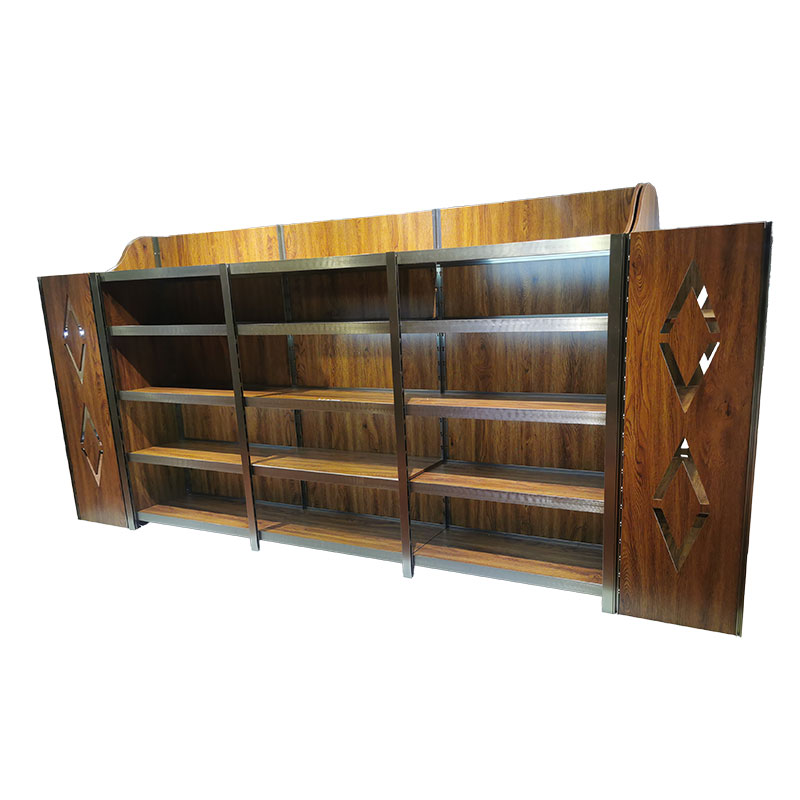
Grocery supermarkets are one of the most popular retail sectors today. The cost of opening a store is not high, and the development prospects are great, and it is now everywhere. However, when you open a store, you will find that your grocery store is not as crowded as others, and you can only worry there. In fact, the number of customers entering the store is not only related to marketing methods, but also to the layout design and shelf placement of fresh supermarkets. So what should you pay attention to when placing supermarket fresh shelves?
Follow the rules of vision and display the series of products vertically. The customer's visual law is that it is convenient to move up and down vertically, and the upper and lower angle of the line of sight is 25°. When customers select items at a distance of 30-50 cm from the fresh shelf, they can clearly see the items set up on the vertical 1-5 fresh shelves. It is much worse than the former when people's vision moves horizontally. The angle between the left and right of people's line of sight is 50°. When customers select products from a distance of 30-50 cm from the fresh shelf, they can only see the products displayed at a distance of about 1 meter horizontally, which will be very inconvenient.
The combination of left and right is a common commodity display technique. Generally speaking, when customers enter the store, their eyes will involuntarily shoot to the left and then to the right. This is because people see the West from left to right, that is, impressively looking at things on the left and steady at things on the right. Take advantage of this shopping habit to display eye-catching items on the left side of the store, forcing customers to stay, thereby attracting customers' attention, giving full play to the role of the left side of the store, and promoting merchandise sales. Therefore, store operators can make full use of this feature and use different positions of commodity display to give customers different effects and attract customers' attention to a greater extent.
Merchandise displays can take full advantage of prime locations. The key to improving the daily sales of the store is the sales ability on the fresh shelf. When an item is swapped in the top, middle, and bottom positions in the display, the sales of the item move from bottom to top, and from top to bottom. The "previous paragraph" placement has obvious advantages. This location is often used to display high-margin merchandise, private-label merchandise, owned resellers, or distributed merchandise. In the other two stages of the display, the upper layer usually displays the products that need to be recommended, and the lower layer usually shows the products whose sales cycle has entered a recession.
Open the distance between the sales area and the payment platform. Because the deliberate placement of goods will affect the psychology of customers. Stores can design various long shopping channels to avoid customers taking shortcuts to checkout and exit. As customers walk around or look for checkout, they may see other items that make a purchase. Therefore, the location of the store's payment platform can be deliberately set far away from the goods, so as to promote customers to be attracted by other goods when paying and have a desire to buy.
While the product display is fixed, it should also change periodically. From the customer's point of view, most people prefer to place items in a relatively fixed position. In this way, when it visits the store again, it can reduce the time to find items and improve the shopping efficiency of customers. Store operators should take note of this, but in doing so, it's easy to lose customers' attention to other items and create a stale and rigid feel. Therefore, it is also possible to adjust the items on the fresh shelves after the items have been placed for a period of time, so that customers are attracted to other items when they re-find the desired items, and at the same time have a fresh feeling for the changes in the shopping center.


 English
 русский
 Deutsch
 Español
 中文
中文


