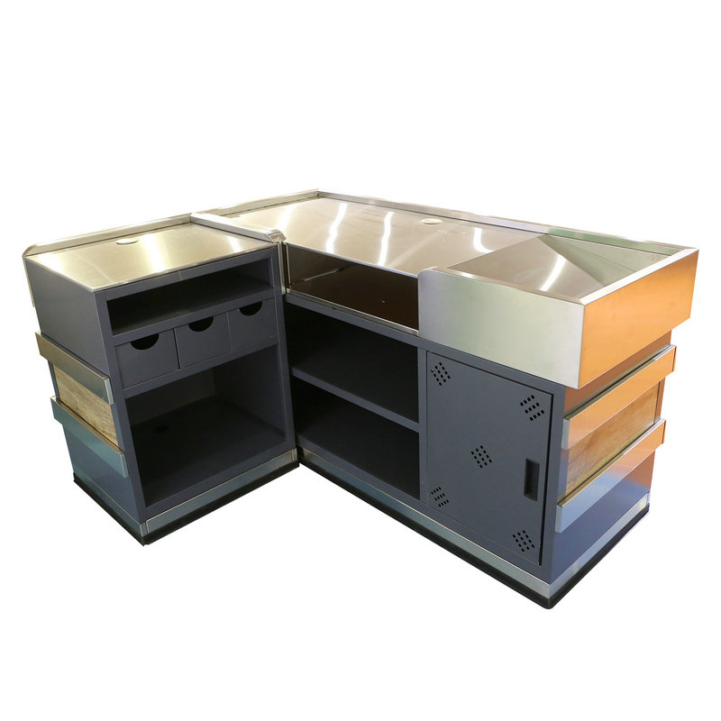
The optimization of space at the checkout counter is a meticulous process that aims to balance the efficient processing of customer transactions with the ergonomic needs of cashiers. Here's a detailed explanation of how space is optimized:
Layout and Counter Configuration:
The layout is carefully planned to allow for multiple checkout lanes, each equipped with a dedicated checkout counter. The counters are organized in a way that minimizes congestion and provides a clear flow for customers.
Checkout Lane Width and Spacing:
Each checkout lane is designed with an appropriate width to accommodate shopping carts and baskets comfortably. Adequate spacing between checkout lanes prevents crowding and allows for smooth customer flow.
Conveyor Belt Integration:
A conveyor belt is integrated into the checkout counter design to facilitate the movement of customer items from the shopping cart to the cashier. The length of the conveyor belt is optimized to handle varying quantities of items efficiently.
Bagging Area Design:
A designated bagging area is incorporated into the checkout counter, providing sufficient space for cashiers to organize and pack customer purchases. The bagging area is strategically positioned for easy access by both the cashier and the customer.
Ergonomic Considerations for Cashier Movement:
The positioning of the bagging area and other operational elements is carefully considered to minimize the need for cashiers to reach excessively or perform awkward movements. This helps prevent strain on the cashier's back and shoulders.
Clearance for Cashier and Customer Interaction:
Adequate clearance is maintained around the checkout counter to facilitate smooth interactions between cashiers and customers. This ensures that customers can easily place their items on the conveyor belt and retrieve bags without feeling cramped.
Technology Integration:
POS systems, monitors, and barcode scanners are seamlessly integrated into the checkout counter to optimize space. Monitors may be strategically mounted or designed as part of the counter, maximizing workspace without hindering the cashier's view.

Customer-Facing Displays and Promotional Areas:
Space is allocated for customer-facing displays, where promotional content, pricing information, and loyalty program details can be easily viewed. These displays are positioned to engage customers without impeding the cashier's operational efficiency.
Queue Management Systems:
Space is reserved for queue management systems, including stanchions, ropes, or digital displays that guide customers to form organized lines. This ensures that waiting customers do not encroach on the operational space of the cashier.
Security Features without Compromising Space:
Security features, such as surveillance cameras and anti-theft systems, are discreetly integrated into the checkout counter design. This is done in a way that maintains an open and welcoming atmosphere without sacrificing security measures.
By considering these elements in the checkout counter design, supermarkets aim to create an environment that optimally utilizes space to meet both the operational needs of cashiers and the convenience of customers, resulting in a seamless and efficient checkout experience.

 English
 русский
 Deutsch
 Español
 中文
中文


